I recently ran PageSpeed Insights against my personal site,
https://aolabs.dev, expecting the usual mild complaints about fonts, some
blocking CSS, and maybe a third-party script or two. Instead, I got a brutal
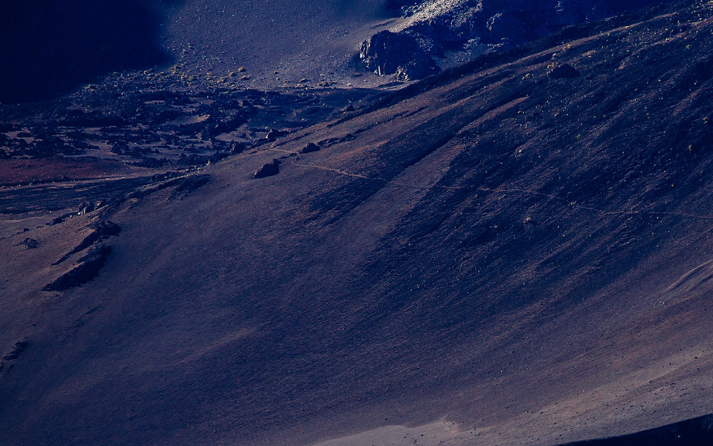
result. The mobile report came back with a Performance score of 62 and a
Largest Contentful Paint (LCP) of 26.8 seconds. That is not a rounding
error. That is the kind of number that tells you something is structurally
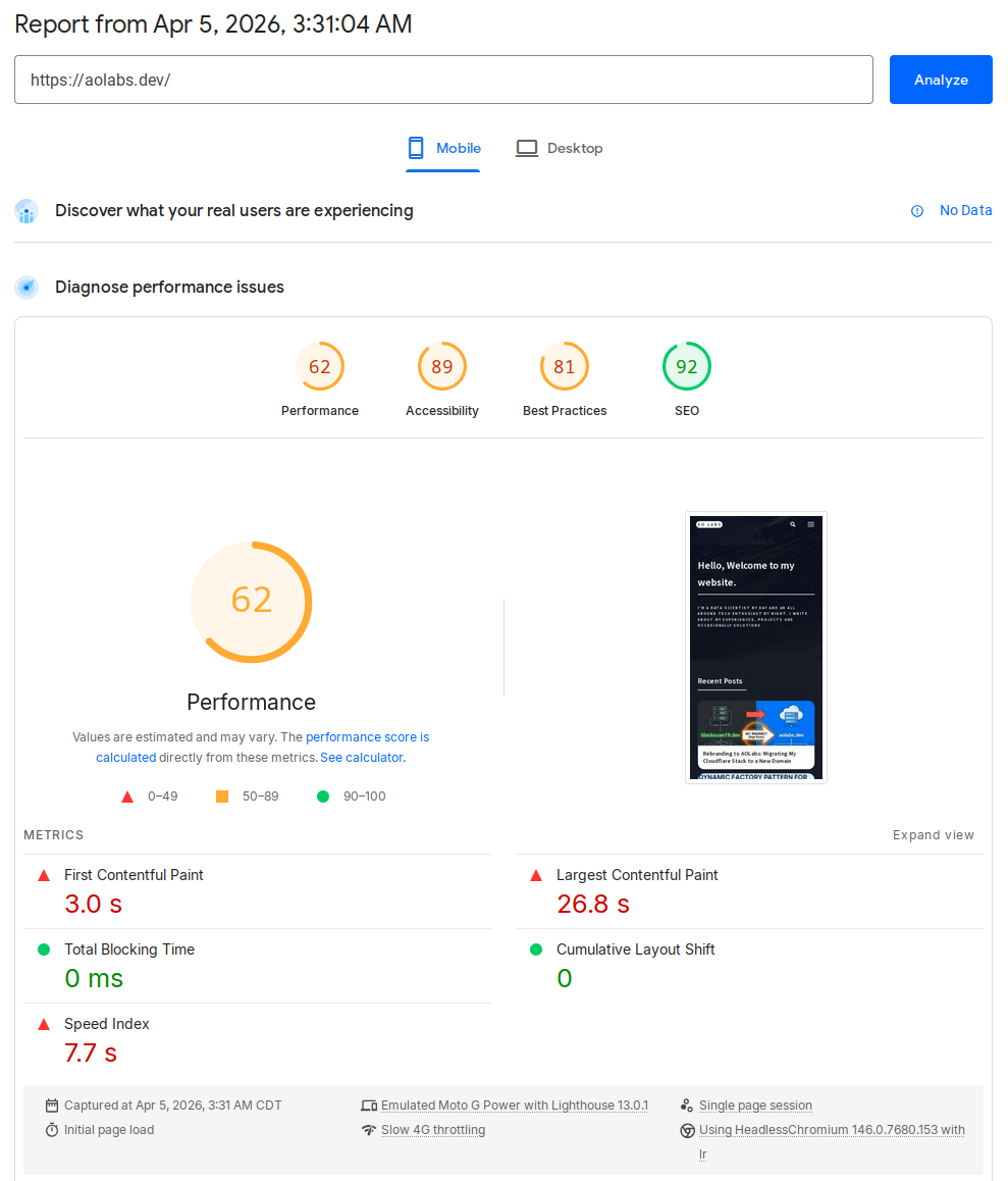
wrong. After a focused round of investigation and a small but deliberate rebuild
of my image delivery pipeline, the same page now scores 93 on mobile, with
LCP down to 2.7 seconds.
This post walks through the actual engineering work behind that improvement:
- identifying the real bottleneck instead of chasing generic Lighthouse advice
- replacing theme-era background-image tricks with real responsive images
- building a Python script that generates responsive WebP variants for the entire site
- storing those results in a manifest Jekyll can consume at render time
- making the optimizer incremental, parallel, and safe to rerun
This is not a generic “use WebP” post. This is the exact implementation I used on this Jekyll site.
The Before and After
Here are the numbers from the two PageSpeed mobile runs.
| Before | After |
|---|---|
 |
 |
Performance 62 • LCP 26.8 s |
Performance 93 • LCP 2.7 s |
| Metric | Before | After |
|---|---|---|
| Performance | 62 | 93 |
| First Contentful Paint | 3.0 s | 2.4 s |
| Largest Contentful Paint | 26.8 s | 2.7 s |
| Total Blocking Time | 0 ms | 0 ms |
| Cumulative Layout Shift | 0 | 0.001 |
| Speed Index | 7.7 s | 2.4 s |
The two most important details are:
- LCP collapsed from 26.8 s to 2.7 s
- Image delivery savings dropped from about 5.6 MiB to 59 KiB
That tells the story pretty clearly. This was not a JavaScript execution problem. It was an asset discovery and image delivery problem.
What Was Actually Wrong
Once I inspected the homepage structure, the problem became obvious.
1. The homepage banner was a CSS background
The landing banner was using a large banner.jpg as a CSS background. That is
already a poor fit for an LCP element because the browser cannot treat it like
an ordinary content image with normal resource priority and responsive source
selection. It also meant I had a single heavyweight banner image instead of a
responsive set of banner candidates.
2. Tile images were being converted into CSS backgrounds by JavaScript
My theme originally rendered tile <img> elements, then took the image src in
JavaScript, copied it into background-image, and hid the original image.
That destroys most of what makes responsive images useful:
- no
srcset - no
sizes - no native source selection
- no proper lazy loading behavior
- no meaningful control over what mobile devices fetch
In other words, the markup looked image-friendly, but the runtime behavior was still background-image driven.
3. The homepage intentionally shows a lot of tiles
One tempting answer would have been to simply reduce the tile count. That would improve the score, but it would also be the wrong fix for this site because the homepage tile density is intentional. The right constraint was this:
Keep the same content density, but make the browser download the right image for the current viewport.
That changes the solution from “show less” to “deliver better”.
The Design Constraints
I wanted a solution that satisfied a few requirements:
- Keep original source images in the repository
- Generate optimized variants automatically
- Work for the whole site, not just the homepage
- Be incremental, so reruns are fast
- Be robust enough to survive interrupted runs and partial outputs
- Be easy to consume from Jekyll templates
That led to a simple model:
- Original assets are the source of truth
- Generated variants are delivery artifacts
- A manifest maps source images to generated variants
- A shared Liquid include renders responsive markup everywhere I control the HTML
Building the Image Pipeline in Python
I wrote a small script at scripts/optimize_images.py to walk assets/images,
generate variants under assets/images/optimized, and emit a manifest to
_data/optimized_images.json.
At the top level, the script establishes a few core paths and defaults:
ROOT_DIR = Path(__file__).resolve().parent.parentIMAGES_DIR = ROOT_DIR / "assets" / "images"OPTIMIZED_DIR = IMAGES_DIR / "optimized"MANIFEST_PATH = ROOT_DIR / "_data" / "optimized_images.json"DEFAULT_WIDTHS = (320, 480, 640, 768, 960, 1280, 1600, 1920)RASTER_EXTENSIONS = {".jpg", ".jpeg", ".png", ".webp"}SKIP_DIRS = {"optimized"}DEFAULT_WORKERS = max(1, min(8, os.cpu_count() or 4))There are a few deliberate choices here.
- The optimizer skips the generated directory so it never tries to optimize its own output.
- Widths are opinionated but generic enough for most layout scenarios.
- The worker count is capped to avoid turning a laptop into a space heater.
Reading image dimensions safely
One detail that mattered more than I expected was handling multi-frame files. If
you call ImageMagick’s identify naively on a GIF or another multi-frame asset,
you do not necessarily get one clean width-height pair back. This is the helper
I ended up using:
def identify_image(path: Path) -> tuple[int, int]: output = run_command( ["magick", "identify", "-ping", "-format", "%w %h", f"{path}[0]"] ) width_text, height_text = output.split() return int(width_text), int(height_text)The -ping keeps the probe lightweight, and [0] ensures I only inspect the
first frame.
Generating variants with ImageMagick
The actual conversion step is intentionally simple. I did not want a huge image pipeline with external services, background jobs, or obscure dependencies. ImageMagick is already installed on my machine, so I used it directly.
def optimize_variant(source: Path, destination: Path, width: int) -> None: destination.parent.mkdir(parents=True, exist_ok=True) command = [ "magick", str(source), "-auto-orient", "-strip", "-resize", f"{width}x>", "-quality", "82", "-define", "webp:method=6", "-define", "webp:auto-filter=true", "-define", "webp:target-size=0", str(destination), ] run_command(command)This does a few useful things in one pass:
- respects EXIF rotation with
-auto-orient - strips metadata with
-strip - prevents accidental upscaling with
-resize {width}x> - emits WebP with consistent quality settings
Choosing which widths to generate
Rather than blindly generating every width in the default list, the script only keeps widths that are smaller than the original, then appends the original size itself.
def eligible_widths(original_width: int) -> list[int]: widths = [width for width in DEFAULT_WIDTHS if width < original_width] if not widths or widths[-1] != original_width: widths.append(original_width) return widthsThat keeps the variant set small and avoids generating nonsense outputs larger than the source image.
The Manifest Is the Contract
The optimizer writes a JSON manifest into Jekyll’s _data directory. That is
what makes the whole system pleasant to use from templates.
A single image entry looks like this:
{ "/assets/images/banner.jpg": { "format": "jpg", "height": 900, "path": "/assets/images/banner.jpg", "source_mtime_ns": 1647999763000000000, "type": "raster", "variants": [ { "format": "webp", "height": 200, "path": "/assets/images/optimized/banner-320.webp", "width": 320 }, { "format": "webp", "height": 300, "path": "/assets/images/optimized/banner-480.webp", "width": 480 } ], "width": 1440 }}The important fields are:
path: the original asset path used by front matter or templatesvariants: the generated responsive candidatessource_mtime_ns: the source timestamp used for incremental runswidth/height: intrinsic dimensions used in markup
Once that manifest exists, Liquid can treat the generated images as data rather than trying to guess filenames.
Making the Optimizer Incremental
Generating variants for an entire site is fine once. Regenerating everything on every run is annoying, so I made the script compare source mtimes with the manifest entry and the generated outputs:
def entry_is_current(source: Path, existing_entry: object) -> bool: if not isinstance(existing_entry, dict): return False if existing_entry.get("source_mtime_ns") != source_mtime_ns(source): return False extension = source.suffix.lower() if extension not in RASTER_EXTENSIONS: return True original_width = existing_entry.get("width") if not isinstance(original_width, int): return False variants = build_variant_index(existing_entry.get("variants")) for width in eligible_widths(original_width): variant = variants.get(width) if not variant: return False variant_path = variant.get("path") if not isinstance(variant_path, str): return False destination = ROOT_DIR / variant_path.lstrip("/") if not variant_is_current(source, destination): return False return TrueThat lets the script emit useful statuses like:
optimizedwhen it actually had to build somethingcachedwhen the existing output is already validindexedfor non-raster assets that are recorded but not converted
After the first full run, this alone made reruns dramatically faster.
Making It Parallel
The first iteration of the script was serial. That worked, but it was obviously
too slow once I pointed it at the full assets/images tree. So I added
ThreadPoolExecutor with a configurable worker count:
with ThreadPoolExecutor(max_workers=args.workers) as executor: future_map = { executor.submit( build_manifest_entry, source, manifest.get(public_path(source)), ): source for source in sources } for future in as_completed(future_map): source = future_map[future] try: entry = future.result() except Exception as error: print(f"failed {public_path(source)}: {error}", file=sys.stderr) failure_detected = True continue if entry is None: continue key, value, status = entry manifest[key] = value print(f"{status} {key}")And exposed it via:
python3 scripts/optimize_images.py --workers 6That was the right tradeoff here. ImageMagick does the heavy lifting, and the Python layer mostly orchestrates independent units of work.
Handling Interrupted Runs and Corrupted Outputs
One thing I hit while developing the optimizer was an interrupted run leaving
behind a broken .webp file. On the next run, the file existed, so a naive
check would assume it was valid. That is how you end up with a pipeline that
looks incremental but fails on stale partial outputs. The repair helper fixed
that:
def identify_variant_with_repair( source: Path, destination: Path, width: int) -> tuple[int, int, bool]: rebuilt = False try: variant_width, variant_height = identify_image(destination) except RuntimeError: optimize_variant(source, destination, width) variant_width, variant_height = identify_image(destination) rebuilt = True return variant_width, variant_height, rebuiltThis is not glamorous code, but it matters. If a tool cannot recover from an interrupted run, it becomes fragile enough that you stop trusting it.
Wiring It into Jekyll
The next piece was making Jekyll consume the manifest without sprinkling image
logic all over the templates. I created a shared include,
_includes/responsive-image.liquid, that looks up the source path in
site.data.optimized_images and emits a <picture> block.
liquid<img src="" alt="">
There are two things worth calling out here. First, yes, the original img src
is still present. That is normal. It acts as the fallback inside <picture>.
Modern browsers use the WebP source candidates, while the img remains the
compatibility fallback. Second, the width and height attributes are intrinsic
dimensions, not rendered dimensions. They exist to reserve layout space and
reduce layout shifts.
Fixing the Homepage Banner
The homepage banner was the LCP element, so it got special treatment. Instead of
a CSS background image, I changed it to real image markup and added a preload in
the <head> for the largest relevant responsive candidate. That gave the
browser a real content image it could prioritize correctly.
- Screenshot placeholder: homepage banner markup in DevTools Suggested image:
the generated
<picture>element for the banner with WebP variants.
Fixing the Tile System
The tile system needed two changes:
- Render tile images through
responsive-image.liquid - Remove the old JavaScript that converted tile
<img>elements into CSS backgrounds
The second part is easy to miss, but it is essential. If the runtime still
copies everything into background-image, the responsive markup does not buy
you much.
After the change, the browser was able to select optimized WebP variants based
on the actual tile size and viewport width. I verified this in DevTools by
checking currentSrc on tile images. The browser was resolving to generated
files under assets/images/optimized/..., and the specific chosen width changed
with the viewport. That is exactly what you want.
The Result
Once the image pipeline was in place and the homepage was using real responsive markup, the improvement was immediate. The mobile performance report moved from a site with one catastrophic bottleneck to a site with a much more ordinary performance profile.
Before the changes, the major findings looked like this:
- Performance:
62 - LCP:
26.8 s - Image delivery savings: about
5,675 KiB - Total network payload: about
6,392 KiB
After the changes, the report looked like this:
- Performance:
93 - LCP:
2.7 s - Image delivery savings: about
59 KiB - Remaining major opportunity: render-blocking requests
At that point, image delivery stopped being the main problem, which is exactly where I wanted to be.
Remaining Work
There is still more I can do. The latest report still highlights render-blocking requests and a small amount of unused CSS. Those are real opportunities, but they are no longer hiding a catastrophic LCP issue. That is an important distinction. Once the dominant bottleneck is gone, the remaining work becomes much more incremental:
- defer or conditionally load non-critical JavaScript
- reduce render-blocking CSS and font cost
- expand
responsive-image.liquidto more image rendering paths over time
But the big win is already in place.
Final Takeaway
The interesting part of this optimization was not “use WebP”. Everyone already knows that. The real lesson was this:
If your rendering path prevents the browser from making good decisions, no amount of asset compression will fully save you.
I had to fix both layers:
- the asset pipeline, by generating responsive variants and a manifest
- the template pipeline, by making the browser see real responsive images
Once those two pieces lined up, Lighthouse stopped treating the homepage like a resource disaster. Just as importantly, I now have a reusable image pipeline for the rest of the site instead of a one-off homepage hack.
If you are working on a Jekyll site with a legacy theme, it is worth checking whether your “images” are actually images at runtime, or just a thin wrapper around old background-image tricks. That difference alone can be worth tens of seconds of LCP.